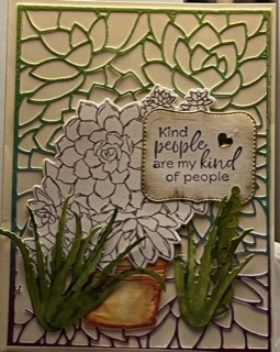
I was recently in New Mexico, so this succulents stamp set (Simply Succulents #154480, pg 32 in the Annual Catalog) really resonated with me! There is also a coordinating die set, Potted Succulents (#154330 pg 173 in the Annual Catalog). The die set includes the background cutout as well as the floral shapes, flowerpot and several label shapes. I cut the background die from some vintage shimmer paper, but you could achieve this look by inking silver shimmer paper with different ink colors or blenders. I inked the agave and flowerpot die cuts with blenders, but left the succulent blank for contrast. There are some other sentiments with the stamp set that I like as well, and will definitely use on some future cards!
To order the stamp and die sets, please use the link on the green heart!
What inspiration have you used for your cards? Please leave a comment and let me know!
Do you ever want to make a card and have to spend more time FINDING all the parts then it take to actually MAKE the card? That has happened to me WAY TOO many times! I have been devoting 2022 to eliminating that problem! Every Tuesday I spend some time ORGANIZING my stash. And after over 10 years with Stampin’ Up!, have I got a STASH! I love color (I think I have mentioned that before…hehe), so I have EVERY SU color inkpad that has come out over that time, PLUS the re-inkers, markers, cardstock and blenders to match. OOF! Realistically, I use the current colors 99.9% of the time, so I have spent most of my time organizing my stamping area for easy access to those colors of paper, inkpads, etc. Recently, Stampin’ Up! has come out with some marker and Inkpad storage solutions, which I have purchased, and they help. But for other things, I have started accumulating Stamp-n-Storage products (www.stampnstorage.com). They are very well made, ship quickly, and customer service has been great!
My first purchase was 4 of the 8 1/2″ x 11″ cardstock storage cubes – a bit of an investment but SOOOOO much easier than digging through piles of cardstock packages! I could have organized these in a few ways, such as by the SU color groupings, or, as a lot of folks do, by color (rainbow, light to dark, etc.), but I chose alphabetical by name. It does mean that when the new colors come out each year, I will have to move some labels around, but it just makes more sense to my little mind – no time wasted guessing whether that “Blue” is “Night of Navy” or “Misty Moonlight”. I also realized I needed to restock some colors! Yikes! I chose the version with 15 slots per cube, so I can easily fit all 40 SU regular colors, the 10 colors that change every 2 years, the 3 basic colors (black, vanilla and white) and my absolute favorite paper, shimmery white, with a few left (maybe store my catalogs there for the year?)
Here’s where I was a few months ago as I started to fill up the cubbies with the paper in proper order at the time (I’ve since incorporated the 2022-2023 colors):
What are your favorite organizing tips? and…how would YOU organize your colors?
Posted onJune 9, 2019byPat Baker|Comments Off on Using Pigment Powders to create a background
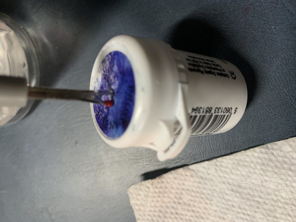
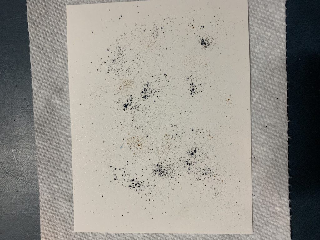
One of the new Stampin’ Up! products that I like the most is the Pigment Powder Collection. There are six small containers, each with a different color powder. When using the pigment powder containers, do NOT, I repeat, do NOT open the containers! The best way to use the powder is to make a small hole in the top of the container and either SHAKE or TAP the powder onto the Cardstock. (I used my seamripper – it’s what I had handy!!!).
Just remember, a little goes a looooong way with the pigment powders! It doesn’t look like much in this photo – but the color is INTENSE when it gets wet!
You can shake the powder on a dry or a wet card. If you use a dry card, as I did, spritz the card with water and tilt the card to get the ink to flow over the surface.
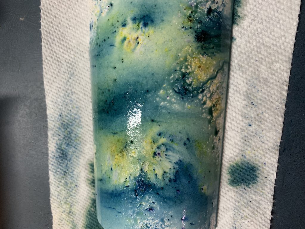
Blot the card with a paper towel – it will flatten out a bit. Either wait till dry or when still damp, shake more powder and spritz again to cover up any white areas. Blot again and let dry.
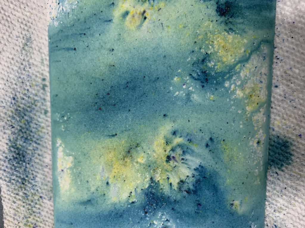
This final version has better coverage. I’ve used my favorite paper for this background, Shimmery White – it has a subtle sparkle that you can see when you move it in the light.
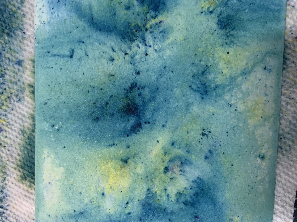
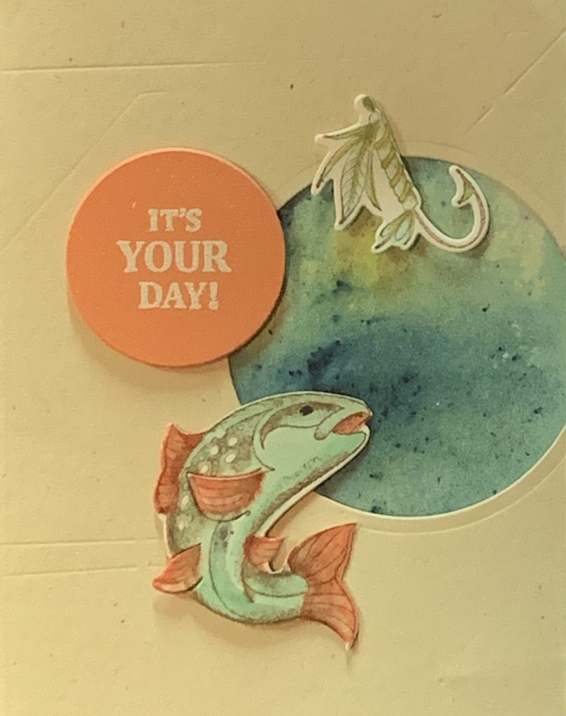
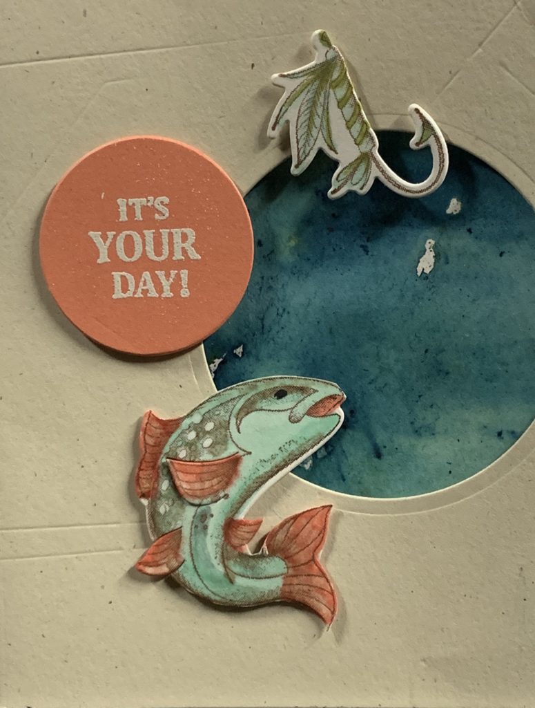
I think the blue and yellow pigment powders make a perfect watery look, just the thing for the background of my Father’s Day card that I posted yesterday!
I love the way the yellow area is near the top and the darker area near the fish – it helps the fish stand out more, and appears that the hook is near the top of the water! It is so much fun to make these backgrounds with the pigment powders – you never know what you are going to end up with – but it is always beautiful!
What pigment powder colors would YOU use for your backgrounds?
Comments Off on Using Pigment Powders to create a background
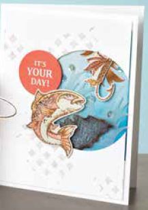
This is my version of the card in the Stampin’ Up! Annual Catalog.
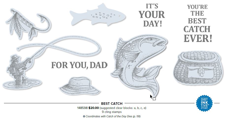
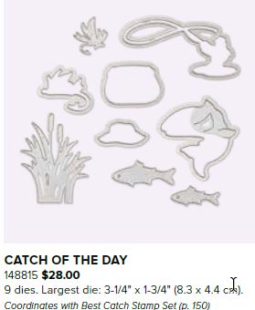
Besides the “Best Catch” (#148598) stamp set and “Catch of the Day” Thinlets (dies) (#148815), I used the following products:
Stampin’ Dimensionals (#104430)
Layering Circles Thinlets (#141705)
Shimmering White Cardstock (#101910)
Pigment Sprinkles (#148553)
Bermuda Bay Stampin’ Blends Combo (#144600)
Calypso Coral Stampin’ Blends Combo (#144045)
Old Olive Stampin’ Blends Combo (#144597)
Stampin’ Blends Color Lifter (#144608)
Very Vanilla Cardstock (#101650)
Grapefruit Grove Cardstock (#146972)
Versamark Inkpad (102283)
Stampin’ Embossing Powder – White (#109132)
Heat Tool (#129053)
Finally, I used my BigShot to cut the paper with the dies. (Stampin’ Up! is in the process of manufacturing their own die-cutting system, so the BigShot is no longer being sold through the catalog.)
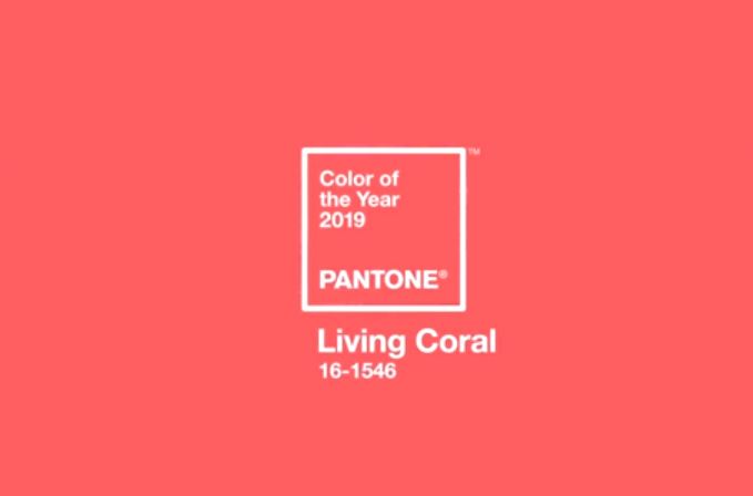
I HAD to use Calypso Coral and Grapefruit Grove – It’s the closest we have to. Pantone’s Color of the Year, Living Coral!
Tomorrow I’ll have a little tutorial on how to use the Pigment Sprinkles (very similar to the “Brusho” pigments). I think it made a great watery background for the fish and hook!
My Dad loved to fish – we would go fishing at least once every year during our vacation to the beach – the ocean was at one side of the town and the bay at the other. Of course my (younger) brother caught the BIGGEST Flounder one year – almost a big as he was! There are lots of stamp sets in the new catalog that you could use for other activities the men in your life like to do – from sailing to cars to horses – even a camera or a cup of coffee!
The Pantone Color of the Year, announced last December, is Living Coral –
Well if you follow my blog, you know how much I love COLOR(!), and while I wish Stampin’ Up! had the exact match, there are 3 that are CLOSE – Grapefruit GroveGrapefruit Grove was one of last year’s In-Colors and will retire at the end of our new catalog year.
Terracotta Tile Terracotta Tile is one of this year’s In-Colors and will be around through the 2020-2021 catalog year.
Calypso Coral Calypso Coral is in the permanent Subtles collection of colors.
So there is plenty of time to use these lovely colors and be on trend with the Pantone Color of the Year!!!
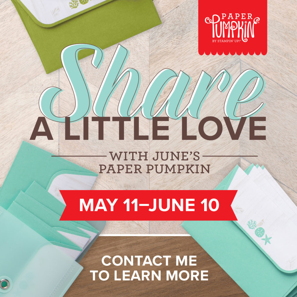
The My Paper Pumpkin June kit makes it easy to scatter sunshine this summer—whenever, with whomever. Not only do you receive 16 fun-sized, beach-themed cards and envelopes, but this kit also includes a carrying case so you’ll always have your cards on hand to share wherever you go. And don’t forget the exclusive stamp set and ink spot that completes every Paper Pumpkin kit!
June Kit Coordinating colors: Coastal Cabana, Crumb Cake, and Old Olive
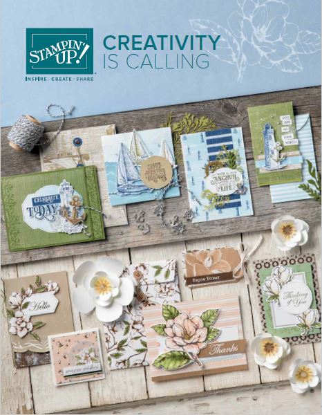
Posted onJune 4, 2019byPat Baker|Comments Off on Welcome 2019 – 2020 Annual Catalog!
YES! Creativity IS Calling!
The new 2019-2020 Annual Stampin’ Up! Catalog is HERE, and it’s calling YOU!!! Would you like your own copy??? Contact me (info@mystampalooza.com) to find out how to get your own copy of this great resource for stamps, paper, inks, dies, punches, embellishments and IDEAS!!!
2019-2020 Annual Catalog
Over the next several weeks, I will be sharing samples and general “eye candy” from the catalog – for all level of stampers! I even have some new “quick start” suggestions if you have never stamped before! So when your creativity comes calling – you can answer YES!!!
Comments Off on Welcome 2019 – 2020 Annual Catalog!
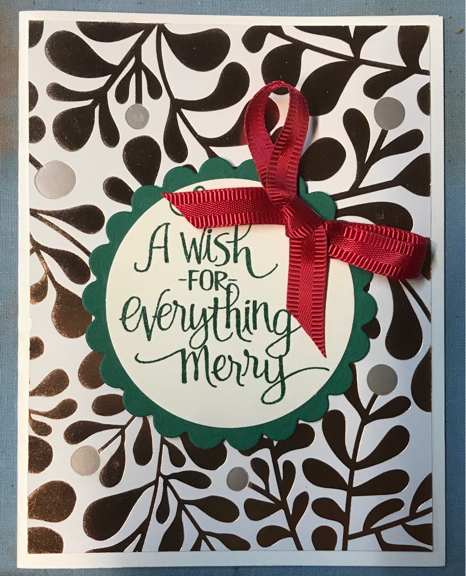
One of my favorite techniques for making multiple cards in quick succession is “One Sheet Wonder”! It’s so versatile because you can cut your card parts ahead of time, following a simple template, and they go together so quickly! Here’s the basic formula: Take one 12×12 sheet of Designer Series Paper, cut it into 4″ strips, then cut each strip according to the template. Generally this makes 14 or more cards! Cut your other card layers in coordinating colors, as listed in the instructions and pick 1 or 2 stamp sets that go with your theme. Punch or die-cut any other layers listed. Pick some embellishments such as ribbon, doilies, rhinestones and pearls, add a couple of snail adhesives, a dimensional pack, card bases and envelopes (Whisper white or Very Vanilla) and finally, coordinating inks, and you are ready to assemble! Honestly, the prep takes longer than the actual card making!
I’ll share my template tomorrow, along with some more cards.
If you want to make 14 fabulous holiday cards – sign up for my class!

 I was recently in New Mexico, so this succulents stamp set (Simply Succulents #154480, pg 32 in the Annual Catalog) really resonated with me! There is also a coordinating die set, Potted Succulents (#154330 pg 173 in the Annual Catalog). The die set includes the background cutout as well as the floral shapes, flowerpot and several label shapes. I cut the background die from some vintage shimmer paper, but you could achieve this look by inking silver shimmer paper with different ink colors or blenders. I inked the agave and flowerpot die cuts with blenders, but left the succulent blank for contrast. There are some other sentiments with the stamp set that I like as well, and will definitely use on some future cards!
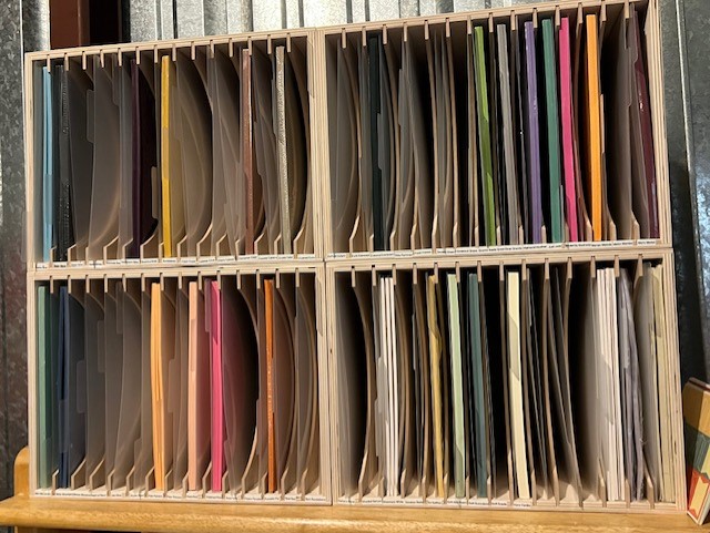

 Grapefruit Grove was one of last year’s In-Colors and will retire at the end of our new catalog year.